
White wall galleries and why we hate to love them.
There was a good deal of shrugging and a lot of dismissal when galleryIntell asked art world professionals what they thought about the so-called “Stieglitz model” – sparse spaces with a sprinkling of art installed on expansive white walls, a.k.a. the white cube galleries. “Nobody’s married to it,” some said; “I’ve done it this way and that,” said others—and “Why are we still talking about this?” yet others asked.
Answer: because the huge, spare, white walled, grey-floored gallery remains ubiquitous.
Despite near universal agreement that white is not the only way to go, it was quite notable when Paris’ Musée d’Orsay, redecorated in 2011 with colored walls that they felt were more appropriate to the colors used in late 19th century paintings. They joined the National Gallery in London, which uses color to a rich effect that is rarely, if ever, questioned. But New York’s museums and galleries, from The Met to The Whitney, and The Museum of Modern Art remain, for the most part, stark screaming white.
As do many of our older upscale galleries. Pop into 980 Madison and visit Gagosian’s scrubbed white space. Then peek into a random sample of the newer galleries that populate the 3rd floor of the building: warm white, grey white, matte white, ecru… huge grey-floored cubes and rectangles.
Speaking to the issue in his usual breathless rant, Jerry Saltz, the art critic for the New York Magazine said, “I think that what needs to happen is to throw out all the architects who design gigantic impersonal white spaces for art. What the fuck is wrong with a series of smaller galleries—a.k.a. rooms? Um, like at The Met, for example. What’s with our addiction to spaces that look like garages and Niketown? I could give a crap what color the walls are painted.”
New York architect, Richard Gluckman is one of those designers. Having designed Steiglitzian white spaces for Paula Cooper, Mary Boone and Larry Gagosian, as well as the Dia Art Center at 548 22nd street and an addendum to The Whitney, in 2011 he went on to build a white walled, parquet floored wing for Sotheby’s to use for sales exhibitions. The firm will soon add renovation of the Cooper Hewitt National Design Museum to its list of brilliantly lit vast white spaces. Till this day Gluckman is sought after for his disciplined minimalist designs. And while the Jerry Saltzes of this world may be looking for a break from the warehouse look, many museums have brought on the wrath of culture critics by adopting more daring alternatives.
galleryIntell’s very informal smattering of polls and questions unearthed many jaded art professionals like Anthony Smith of ASart, who deals in modern and contemporary Asian art. “I don’t know of any gallery that is “wedded” to white walls,” said Anthony, “ I know that we have used coffee, black, grey, cream and deep red over the years to best exhibit the individual art.” And many of the artists we tapped had suggestions, like New York artist Ola Manana’s show space recipe: “Hang paintings on a velvet ceiling. Install large bed-like cushions like they have at la trapeze. Lay on the floor and look at the art.”
But overall, responses harkened back to the safety of whites and neutrals, stressing the importance of “avoiding distraction”, as well as the very general convenience of white:
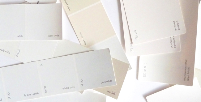
Emma Thurgood, Exhibitions Coordinator at Art Center Sarasota, put it this way, “I think the pervasive white walls of the gallery world have more to do with than any higher reason. It’s a color that you don’t have to put a lot of thought into, it’s largely un-distracting, and it’s not difficult to repair or paint over. Plus, it bounces light around the room like crazy.”
Ahhh, yes: the lighting. White makes light. It stretches and spreads light. And barely a soul disagrees that lighting is crucial. Yet Adam Lindemann opened his Venus Over Manhattan Gallery (in 980 Madison no less) with a pitch dark, spotlit show that worked like a charm! Sure white rules with an iron fist in this 21st Century; but it makes small spots of color, islands of eccentricity, and innovation all the more special. What is more, with the prevalence of global art, and a new trend in figurative and portraiture, who knows but that we won’t return to salon style hangings in townhouse style galleries with coffee colored walls and lamps?
This article ©galleryIntell


